
Website Builder Redesign
About aanmelder.nl
Aanmelder.nl provides intuitive software and hardware solutions to streamline event organization, trusted by over 70,000 events. Its comprehensive platform offers tools for registration, communication, administration, and invoicing, tailored for B2B event organizers. Services include efficient on-site Event Check-In with ticket scanning and badge printing, an engaging Event Platform for seamless online events, and AI-powered Event Streaming for professional, dynamic broadcasts.
UI/UX Design
Venice Rempillo
UX Research & Strategy
Lila Özkazanç
Problem Statement
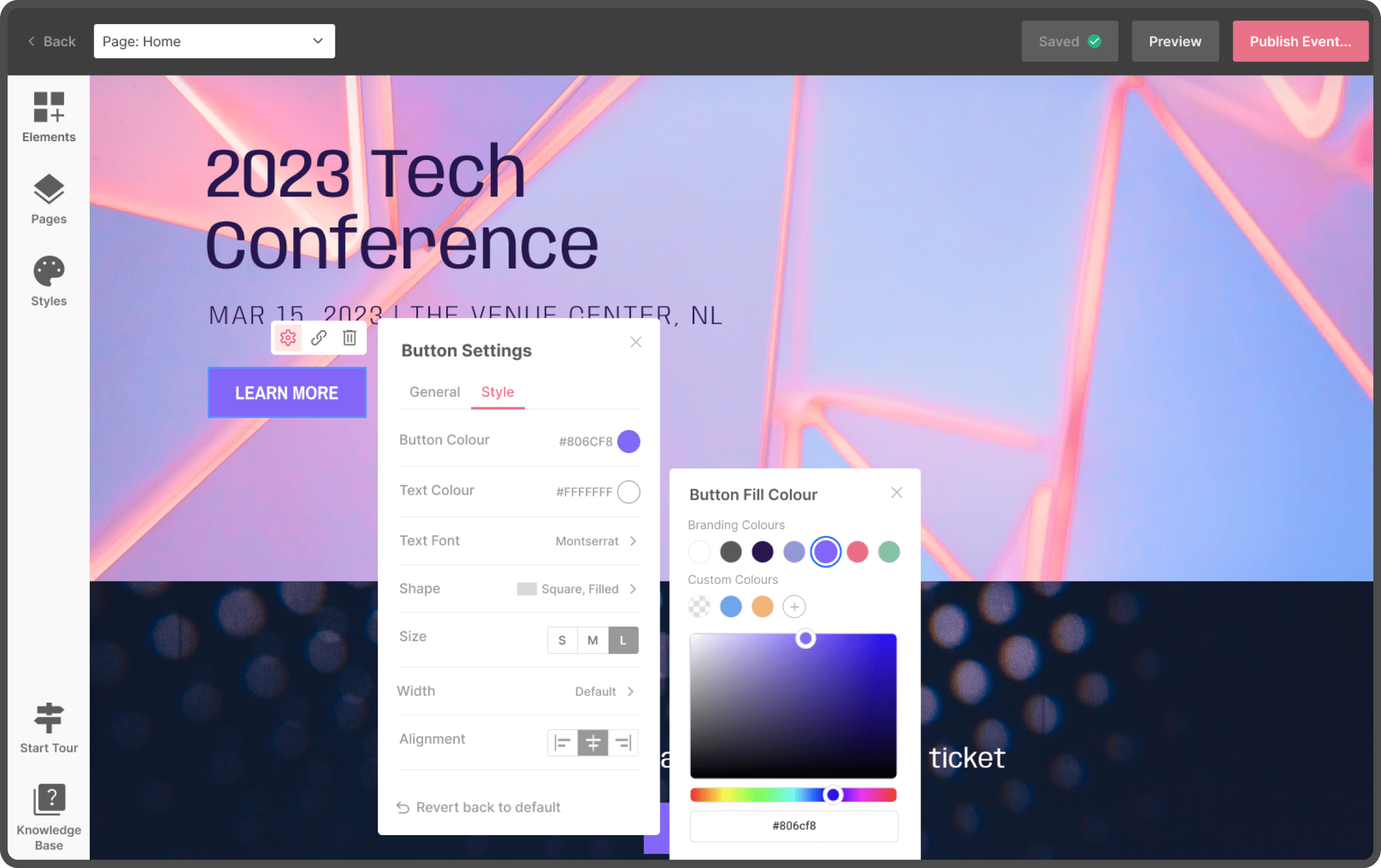
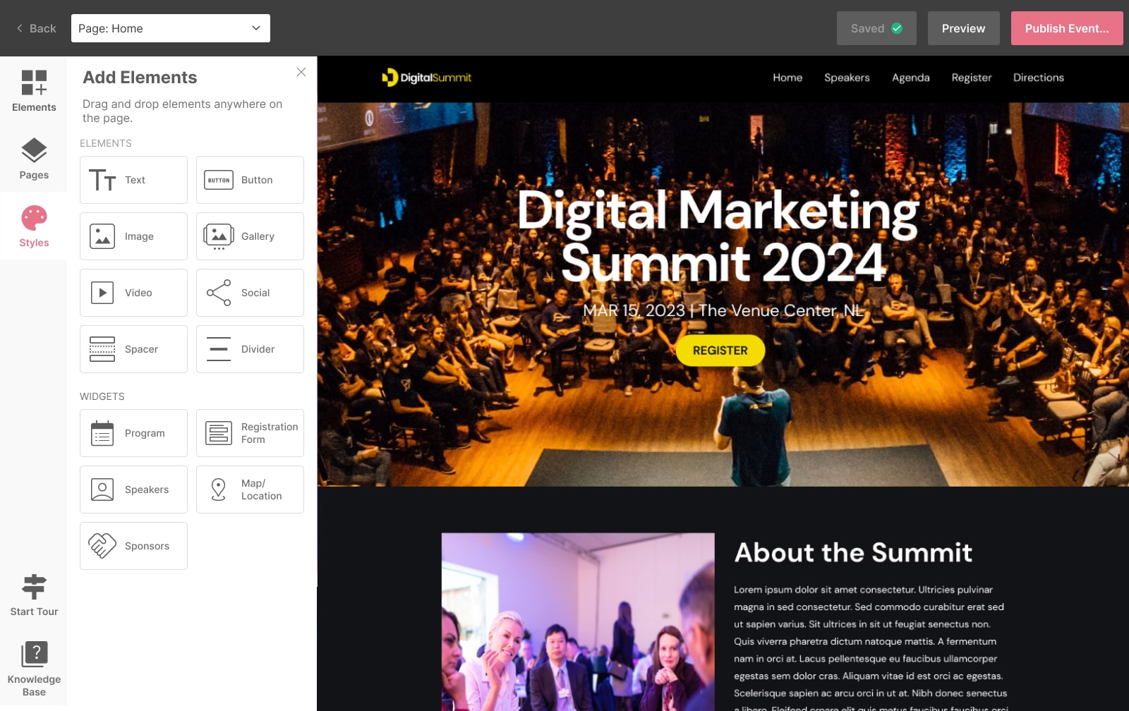
The old website builder lacked a "What You See Is What You Get" (WYSIWYG) approach, making styling changes and progress less visible during the creation process. Users found it challenging to gauge their website’s appearance in real time and faced limited customization options.
Challenges
- Users range from moderately tech-savvy to non-tech-savvy event organizers, many of whom are accustomed to the platform’s outdated structure.
- While the existing platform was deemed easy to use, users desired greater flexibility and a modern, professional aesthetic without compromising usability.
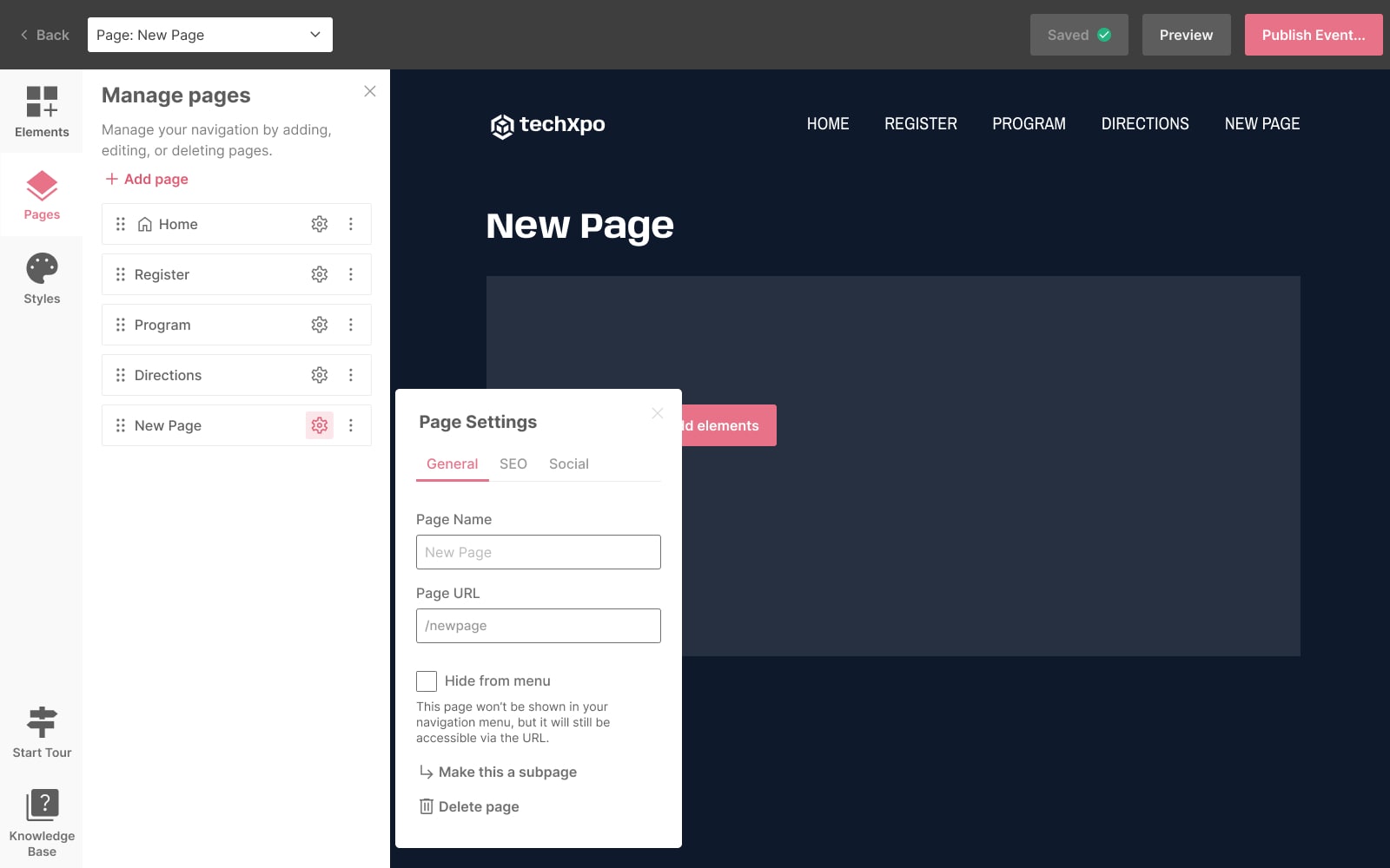
- Ensure the existing dashboard structure integrates seamlessly with the new website builder, offering a smooth transition that keeps users comfortable and minimizes any overwhelm from the changes.
Research & Discovery
Competitive Analysis
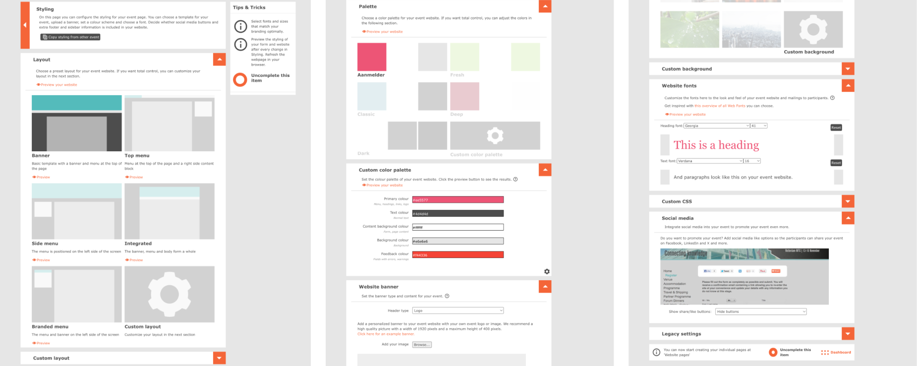
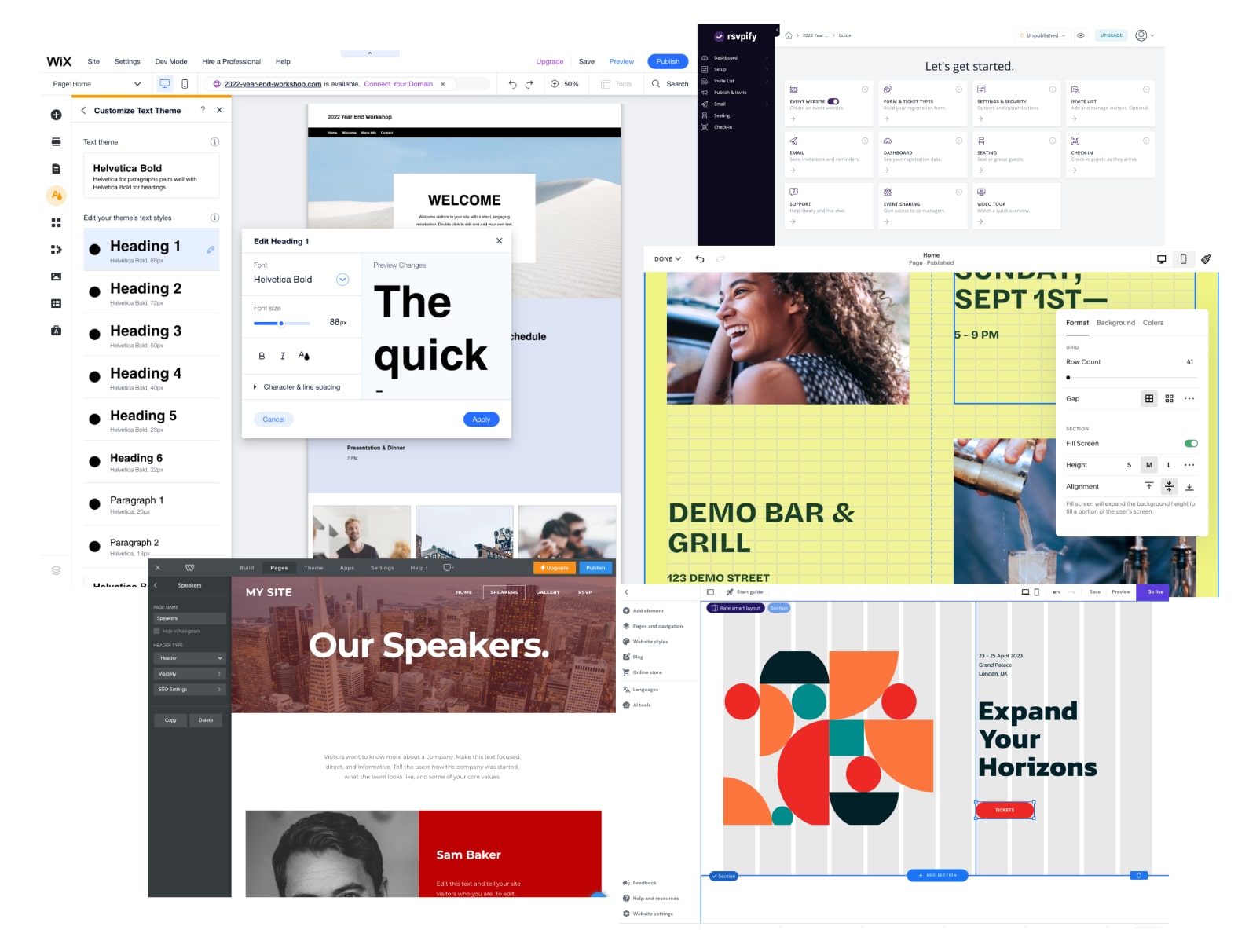
We connducted an in-depth study of leading website builders, including Wix, Squarespace, Weebly, RSVPify, and Zyro. The analysis focused on their drag-and-drop functionalities, WYSIWYG (What You See Is What You Get) capabilities, and overall user experience design.
This analysis provided valuable benchmarks, revealing industry standards and innovative features that set leading platforms apart. It also highlighted areas where these platforms excelled and where they fell short, informing our approach to optimizing the user experience in our own website builder.
User Research
To gain direct insights from the target audience, we conducted a series of user interviews with our current users to understand their needs, pain points, and expectations when creating websites for their events on the existing platform. From the research, it became clear that users strongly preferred simplicity and transparency throughout the website creation process. The overwhelming consensus was that drag-and-drop tools should not only be easy to use but should also provide clear, real-time feedback on design choices. Additionally, users wanted an interface that was beginner-friendly yet flexible enough for more advanced customizations without overwhelming complexity.
Wireframes & Prototype Testing
We began by creating wireframes and low-fidelity prototypes to visualize potential workflows and layouts and conducted internal preliminary testing to validate the concepts.
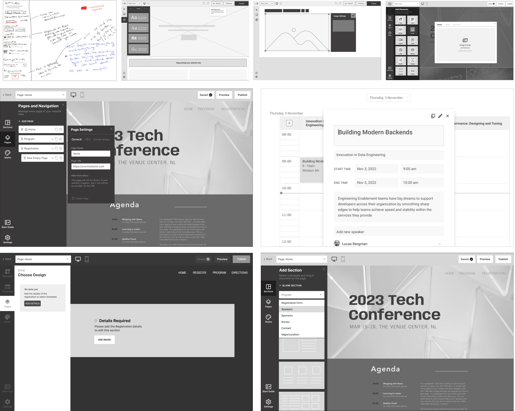
Then we refined the initial prototype using preliminary feedback and conducted a subsequent round of testing with actual users.
The key observations are:
- Users intuitively navigated the drag-and-drop interface without additional guidance.
- The WYSIWYG approach resonated with participants, helping them visualize changes in real-time.
- Editing and customizing elements felt “easy” and “intuitive.”
- Participants expressed enthusiasm for the new approach, citing major improvements over the previous builder.
- Users appreciated the variety of website structure options provided.
High Fidelity Designs
As we developed polished, high-fidelity designs that integrated user feedback from earlier testing phases, we made sure to address issues like:
- Ensuring clarity in terminology, particularly since most users access the platform in Dutch.
- Refining navigation paths within the website builder to eliminate confusion and enhance clarity.
- Aligning expectations with the functionality of the program and speaker widgets, which were not fully met.

Results & Takeaways
- Participants expressed enthusiasm for adopting the new builder, recognising its potential to enhance the visual appeal and overall user experience of their websites.
- Users face limitations in recreating event templates, which prevents them from efficiently and quickly building new event websites by duplicating existing ones.
- Early and consistent user testing was instrumental in shaping the interface to meet user expectations.
- Prioritise resolving existing challenges promptly to build trust and improve overall user satisfaction.
- Small changes can drastically improve the overall user experience
© 2021 Venice Rempillo. All rights reserved.